
Case study completed as part of Google Data Analytics Certificate
- Ask
- Analyze FitBit data to find trends in smart device-wearers and apply to Bellabeat products
- What are some trends in smart device usage?
- How could these trends apply to Bellabeat customers?
- How could these trends help influence Bellabeat marketing strategy?
- Prepare
- Data Used: The data source was ‘FitBit Fitness Tracker Data’ downloaded from Kaggle, made public by Mobius.
- Data Summary: Personal fitness data from 30 FitBit users
- Physical Activity, Sleep, and Heart Rate
- Data Limitations:
- The data was collected in 2016 and only over the course of 31 days, making the data outdated for 2022 trends with a very limited time frame.
- 30 users is a very small sample size – A larger sample would allow us to apply these trends to a larger population (better representation) with a higher confidence level.
- No demographic info on users – This is an especially important limitation to point out since Bellabeat is a women-focused brand. The insights gained from this analysis will not be able to be applied to the specific target audience that Bellabeat is trying to reach.
- Process
- Datasets:
- dailyActivity_merged
- dailyCalories_merged
- dailySteps_merged
- sleepDay_merged
- hourlyCalories_merged
- hourlySteps_merged
- heartrate_seconds_merged
- weightLogInfo_merged
- Cleaned Data:
- Format date field of sleepDay_merged in Excel to match YYYY-MM-DD format necessary for uploading into SQL
- Format date field of weightLogInfo_merged in Excel to match YYYY-MM-DD format necessary for uploading into SQL
- Sort dates to get data range of 31 days
- Check for duplicates in SQL
- Datasets:
- Analyze
#number of participants
SELECT
COUNT (DISTINCT Id) AS num_of_participants
FROM `certificate-project-3.fitbit_captsone.calories`

SELECT
COUNT (DISTINCT Id) AS num_of_participants
FROM `certificate-project-3.fitbit_captsone.weight`

SELECT
COUNT(DISTINCT Id) AS num_of_participants
FROM `certificate-project-3.fitbit_captsone.sleep`

#activity type vs calories by user
SELECT Id,
SUM(LightlyActiveMinutes) AS light_active_mins_total,
SUM(FairlyActiveMinutes) AS fairly_active_mins_total,
SUM(VeryActiveMinutes) AS very_active_mins_total,
SUM(Calories) AS calories_total
FROM `certificate-project-3.fitbit_captsone.daily_activity`
GROUP BY Id
...
5. Share
- 6. Act
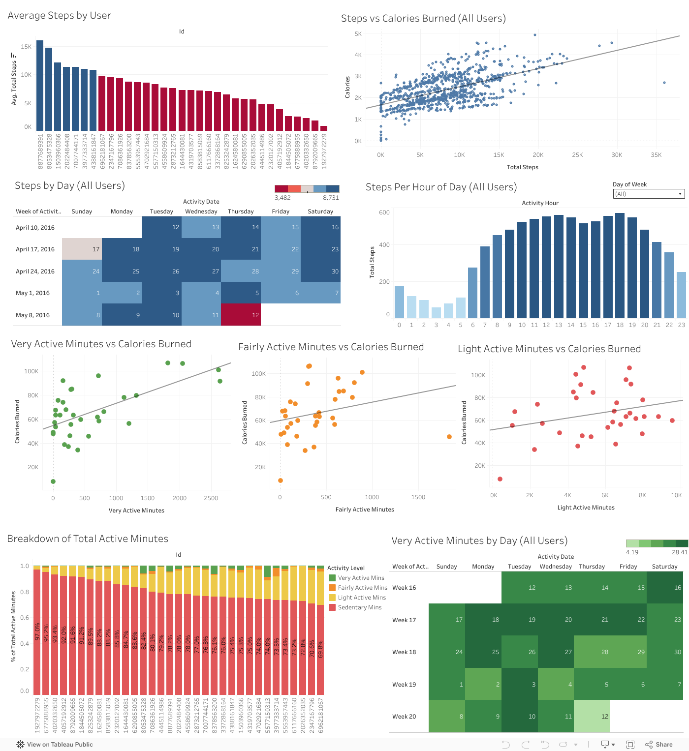
- Only 7 users averaged more than 10,000 steps over the 31 day period (recommended daily step count for active individuals)
- 11 users had more than 10 days with 10k steps in the 31 day period
- 3 users averaged more than 60 very active minutes a day in the 31 day period
- There was a positive relationship between steps taken and calories burned: R-Squared value of 0.33
- It appeared that users were more active during the first two weeks of the data collection period. Users took the most steps on the first Saturday, but had the most intense activity during the week of April 17, 2016
- Users had less intense workouts on the weekends, but took more steps. This is likely due to time restraints- more time on weekends to go for long walks or complete longer duration workouts. With limited time during the week, the trend appears to be shorter and more intense workouts that result in a lower overall step count.
- Users are most active during the 9am-2pm timeframe and 5pm-8pm timeframe. The most steps were taken at 1pm and 6pm (lunch break and end of work day). These trends are similar for both weekdays and weekends.
- There is a positive linear relationship between activity type and calories burned: the higher intensity of activity, the more calories burned.
- The R-Squared value for Very Active Minutes and Calories was 0.37
- The R-Squared value for Fairly Active Minutes and Calories was 0.07
- The R-Squared value for Light Active Minutes and Calories was also 0.07
- The majority of activity for all users is sedentary followed by light activity.
- Recommendations:
- Since users do not appear to be partaking in highly intense workouts and seem to follow a typical workday schedule, the style of Bellabeat products should remain the same as being fashionable and professional rather than an active- style product.
- Focus should be on low- intensity activity types
- Users are consistent with the time of their activity throughout the week meaning they likely have a set work and family schedule.
- Notifications:
- Start workout at 1pm and 6pm
- Encourage users to increase step count since the activity type is primarily low intensity
- Allow user to set a step goal and send notifications at 12pm and 5pm of progress


